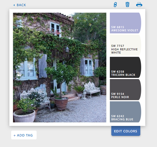
If you know me or have been reading this blog for any time at all, you probably are aware that I’m a bit color-obsessed.
I love how color changes with its environment and lighting. Few things give me as much pleasure as the impact of a fresh coat of paint going onto a surface.
It’s spring now, and my mind goes naturally to paint color and it’s rather mysterious selection process. Here are two amazing paint manufacturers and a really cool tool to help you choose.
1. Donald Kaufman Color. I’ve seen plenty of references to Donald Kaufman Color paints over the years – along with their uber-serious names like DKC-33. (Honestly, no one names paints like Farrow & Ball: Mouseback, Arsenic, Down Pipe – they’re all so evocative. But I digress . . .) But in browsing through an old copy of Elle Decor (one of my favorite magazines), I found an article on the company and the man behind it.
His color palette is disctinctive, and I just love the artistic way he presents it on his website:
If you go to Donald Kaufman Color website you can run your cursor over this image and the colors’ names will come up on your screen. I just love how this color palette is a piece of art itself.
Kaufman was an art professor at UC Berkeley, painting houses on the side, when he began to develop a reputation as an extraordinary color guru. He consulted and in 1990 began his company, actually manufacturing the paint he’d been custom tinting for others for years.
The Donald Kaufman Color collection is thoughtfully edited so that no matter which color you select, it will look fabulous on your walls, and mesh nicely with any other color in the collection.
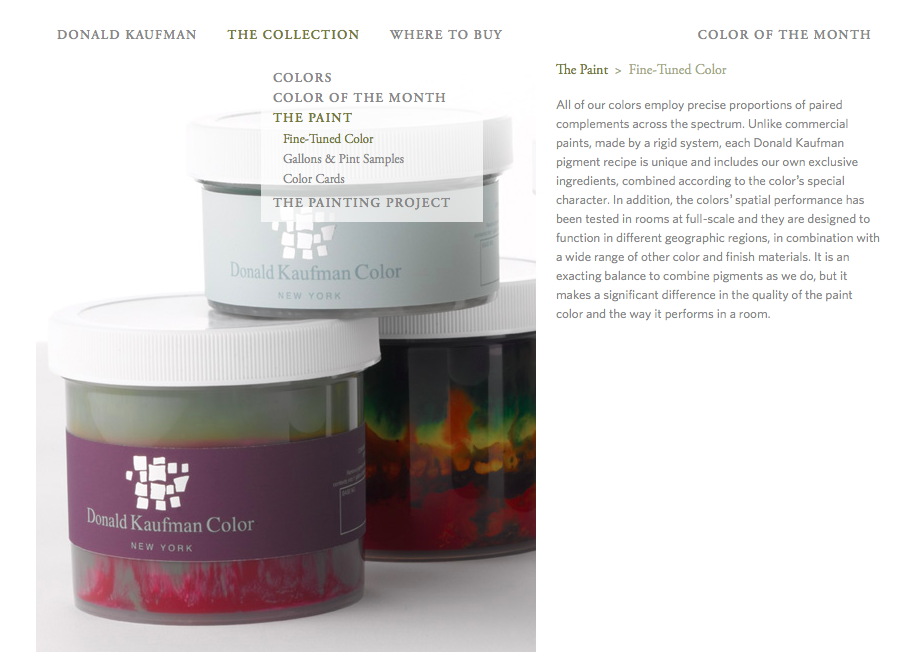
I love the artistic mess you can see through the clear containers of paint.
2. Sherwin Williams’ Snap It tool.
It’s the coolest thing ever for a color junky. Download the tool and it’ll place an icon on your bookmark tabs. You’ve got to log in to use the app, and you’ll have to copy the URL of the image you want into the app to make it work. It’s fabulous if you have a favorite blog or Pinterest group – you can just keep copying that URL into the app, ‘snap’ on the image you love and Boom! your paint color palette appears. It’s not perfect, but it is kinda addictive . . .
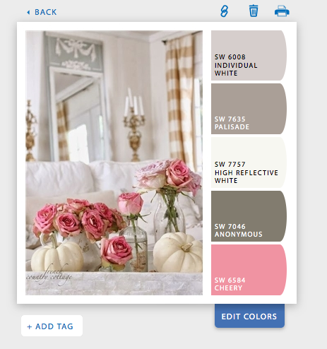
Sherwin-Williams’ Snap It tool lets you find colors in your favorite photographs
On this one I even tried the “edit colors” button. Again, not perfect, but oh-so-much-fun.
3. Farrow & Ball paint.
When it comes right down to it, I just love Farrow & Ball (available locally from Patrick Street Interiors, with a sampling available here at Chartreuse & co). When you go to a Farrow & Ball retailer, you’ll find shelves of mixed paint. You don’t get a big can of white paint which then has so many drops or dribbles of pigment added and then shaken oh-so-vigorously to mix. Farrow & Ball is mixed in huge vats in the UK, contains at least 30% pigment in each can, and is packaged and shipped with an unsurpassed level of consistency. You open the unshaken can to find exactly that perfect color, calmly waiting within. When I paint, I use Farrow & Ball.
In fact, we’ve been working on my daughter’s apartment this week (Mizzle in gloss for her bathroom, Pavilion Grey for her new cabinets in the kitchen)
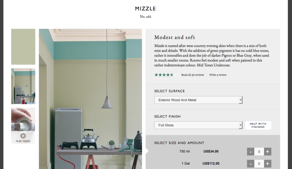
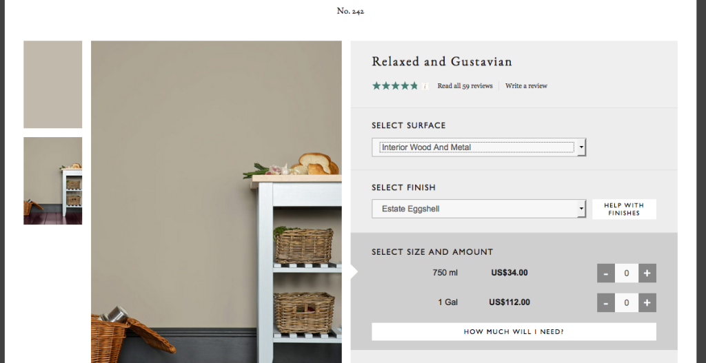
Farrow & Ball’s website gives colors, suggested complementary colors, and photos of them in use. You can purchase the paint online as well.
Farrow & Ball’s Pavilion Grey on the walls of the kitchen
Yes, both of these paints are expensive. But consider this: cheaper paint lasts half as long and lacks the color integrity you get with premium paint. In Sasha’s small apartment, it’s a full day job getting the painting done. The difference in paint cost is about $70 – for the whole project. It’s a bargain when you know you’ll be come up with exactly the right color and finish after all that work. And if you’re paying a painter, the difference as a percentage of the cost of the job is negligible.
So there are my painting tips for the spring. Our next project here on the farm is getting the house and barns painted. HUGE undertaking, which will probably take us all summer. But it’ll be beautiful when we’re finished. (We’ll be using Farrow & Ball’s Railings as trim and a grey stain on the walls to maintain some of the weathered look.)
Thanks for reading,
Virginia
