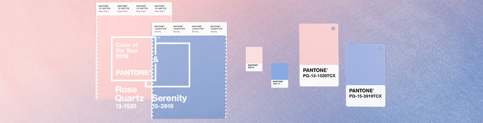
New Year = New Color from that arbiter of tones: Pantone. This year’s Color of the Year is actually 2 colors: Rose Quartz & Serenity. Clearly Pantone sees a return to a softer, subtler palette. I love how they play off each other, and work so comfortably with gold. Take a look:
ROSE QUARTZ:
The soothing, feminine softness of this color is perfect for voluminous curtains. Also fabulous as accent pillows in your bedroom and living room.
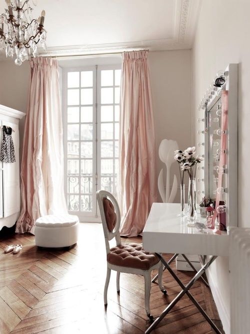
via digsdigs.com
Or go all out, and pop the color with some sleek modern chairs. Notice the deeper shade in the modern context. Also, note the different feel in this sharper look.
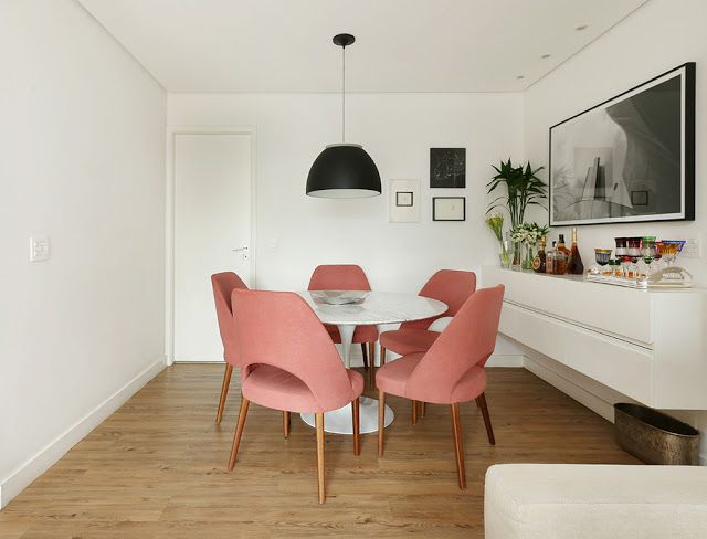
via decorsalteado.com
Here’s an unexpectedly subtle way to use this color: cover your walls. I say unexpectedly subtle, because what could be subtle about painting an entire room pink? Yet this color is so soft, so soothing, it simply gives a space the warmth of a spring sunset. (Totally loving it with grey and gold)
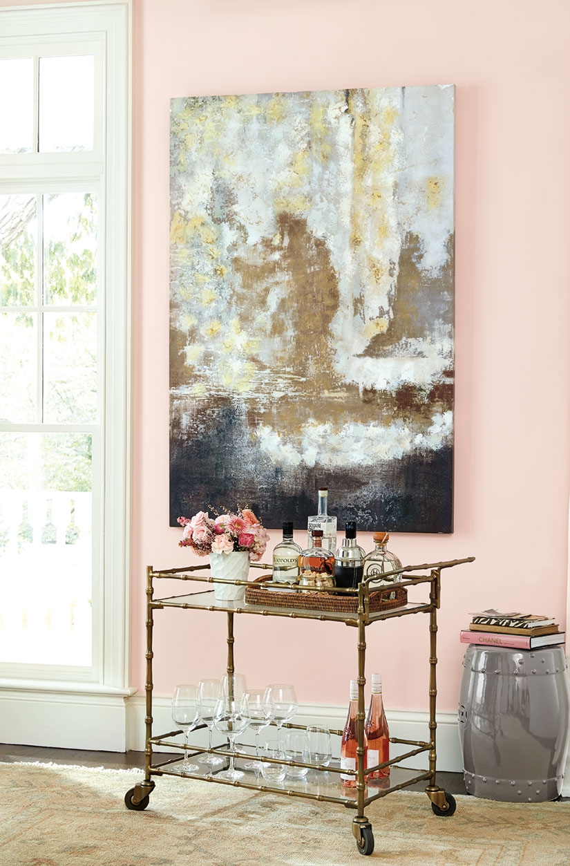
via howtodecorate.com
SERENITY
This color is like a soft mist on a cool day. It’s perfect with wood tones and the bright white makes it sing.
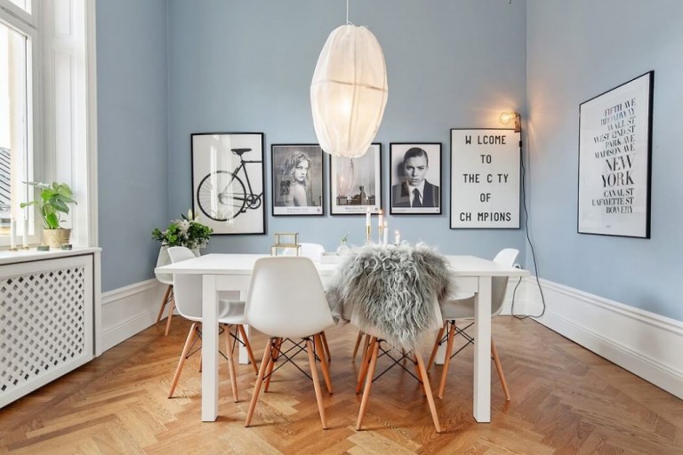
via robindegroot.ca
Look how nicely Serenity pulls off gold and velvet:
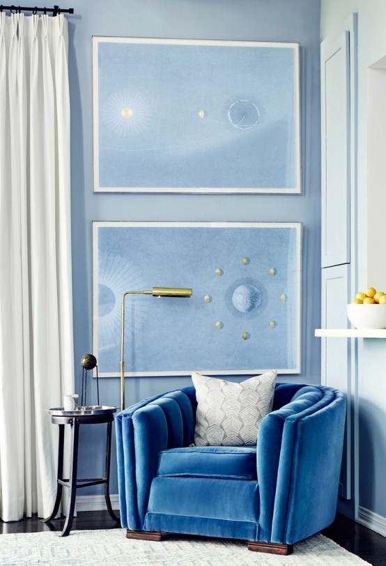
via digsdigs.com
And here are the two colors together:
Rose Quartz walls. Serenity sofa. Great architectural details and lighting certainly help. But I also love the juxtaposition of the crystal chandelier, wooden floors, and cool modern chair. It pops and soothes at the same time.
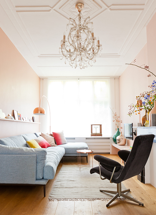
via digsdigs.com
Look around your home and see the ways you can incorporate these delicious colors in 2016.
Thanks for reading!
Virginia