


I love a challenge. And, for me, no challenge thrills me more than a decorating one.
My sister, Margaret Koogle, is a real estate agent, and every now and then she comes upon a house that needs a little staging. Much as I enjoy challenges, I have a few ground rules with decorating: 1. Only with my stuff 2. Only in an house that will be empty. Other than that, I’m all in. So about a month ago she sent me this picture:
Before, living room, Coppermine Road, Woodsboro, MD
And this one:
Before, kitchen, Coppermine Rd, Woodsboro, MD
Now, I’m a brave soul. And I really do mentally re-decorate rooms I spend time in – even doctors’ waiting rooms – just for fun. And, as I said, I love a challenge. But you also need to understand that one of my pet peeves is wood-paneled walls. I mean, WHY?? Why darken your home? Why wrap yourself in wood veneer? I’ve never understood it at all.
So, back to our story, Margaret had just sent me pictures of what is one of my definitions of an unattractive space.
CHALLENGE ACCEPTED!
None-the-less, I whined at her, “Can’t you convince them to at least paint those walls? And the light fixtures? PLEASE let me replace them with my own.”
Margaret felt my pain, but the clients were firm: they would remove their things, but they would not do any work or change any fixtures. So there we were.
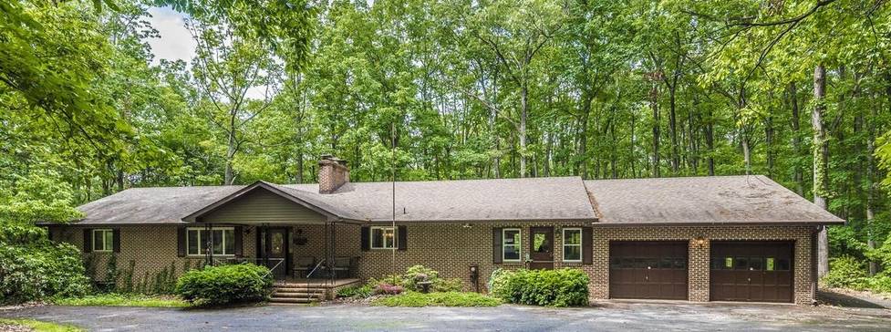
We visited the house, with tape measure and graph paper in hand, walked through every room, got a sense of the house and what it could be. And it’s a GREAT house! The homeowner designed it himself in the late 70s, with an open floor plan, huge fire places, tons of closets, and had it set in a perfectly private and secluded, 12-acre lot. While I would paint the exterior brick and trim, extend the front porch, and replace the metal posts with wooden ones, the house is well built, and enjoys wooded views from every window.
The front door opens directly into the 20’x30′, fully paneled living room. The kitchen lays to the right of the entrance, with the master bedroom behind it, and a breezeway between it and the garage. The additional two bedrooms are to the left of the living room.
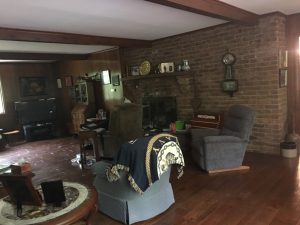
BEFORE:
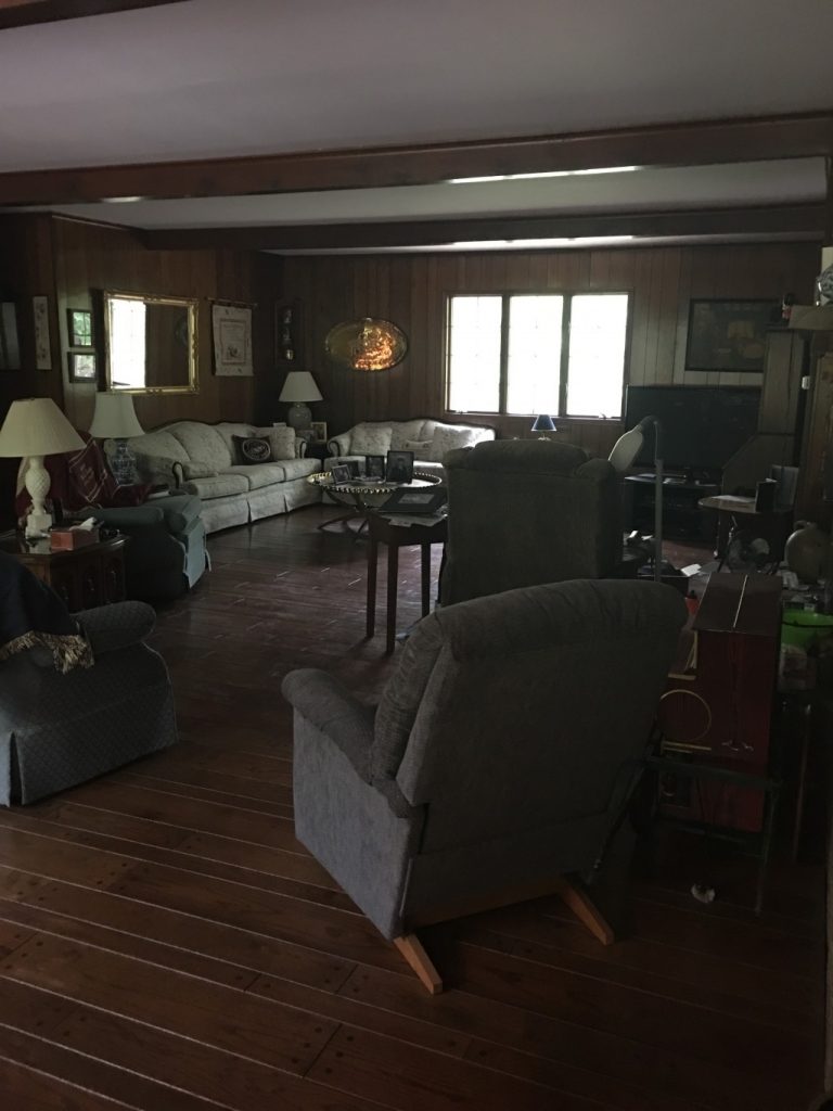
The view as you entered from the front door. The kitchen is to your right. The bedroom hallway opens just to the left of the white sofa, just out of the picture.
When you have a dark space, the key is to embrace it with rich texture and light details. And tons of lighting. Here’s my answer to this room:
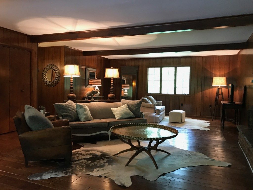
AFTER: The living room as seen from the front door. Note the richness and light the hides give. We added four table lamps and a floor lamp to the space. And the French club chair and velvet sofas provide more texture and inviting comfort. The pops of metal in the brass coffee table and metal-framed mirrors (we added three hanging mirrors, and one, full-length mirror to the space) add more texture. Note that you can see the hallway clearly here. The round, metal-lattice mirror is hanging in the hall. While I’m not a fan of the paneling, we minimized the wall hangings, so that the wood became a comfortable, embracing presence.
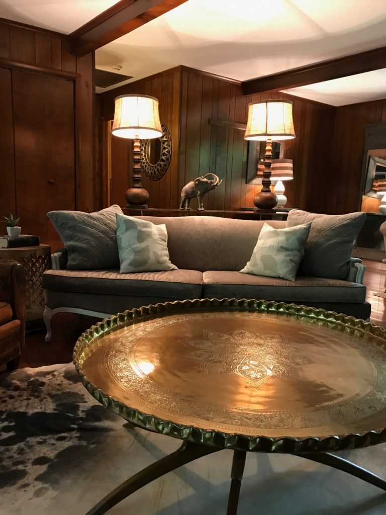
A closer view of the main seating area. With a space this large (20’x30′) you need to give careful thought to the furniture layout. In this case we placed the sofa on a angle so that it looked directly at the entry, as if to welcome you to come and sit a while. That fabulous coffee table was in the room originally. I love it!
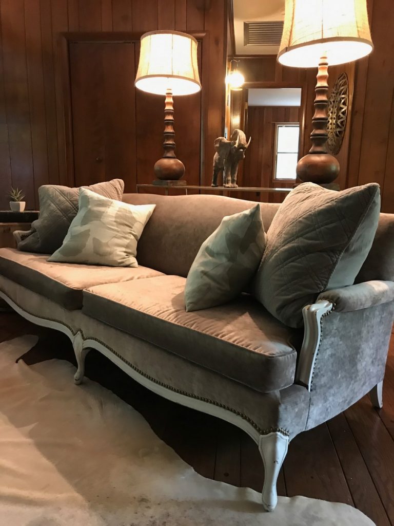
It’s all in the lighting and the textures. I just love little details like the nail-head trim on the sofa, the down pillows, the softness of the hide rug, the burlap shades on the wooden lamps. The lamps were a bit of a risk. With so much wood in the room already, they could have been overkill, but they work perfectly on the slender, metal console table.
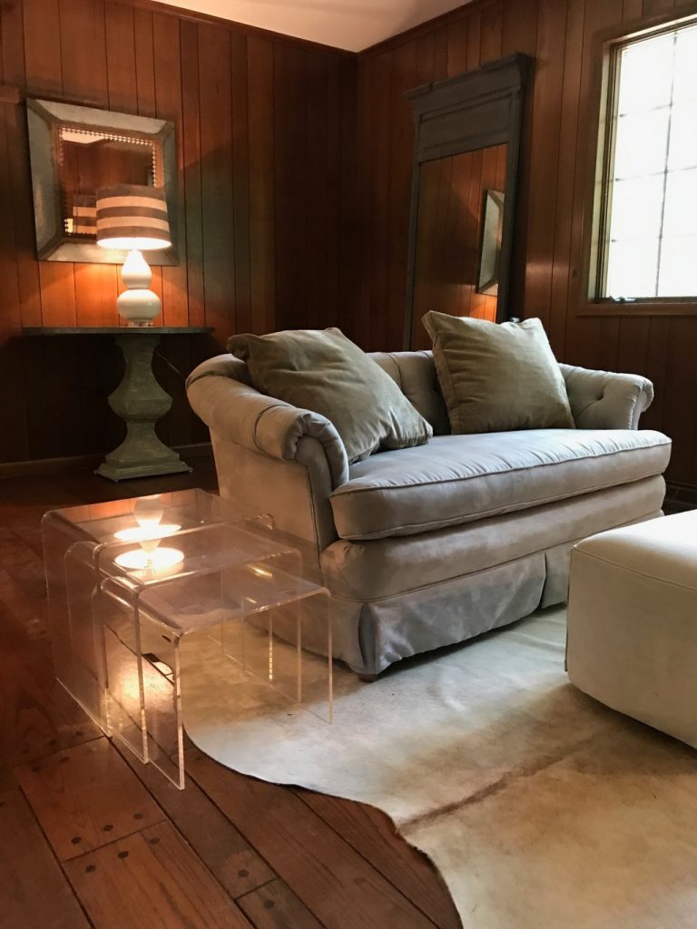
In this large space, we created two separate seating areas. This one, at the back of the room is for TV-viewing, as the hook-ups were all in the corner here. Plus, it’s just nicer to have the TV in the further, more private portion of the room. Again, here, the hide defines the space. You get a good look at the effectiveness of mirrors in a space like this. Also, I just love the sleek, hip element the lucite nesting tables provide.
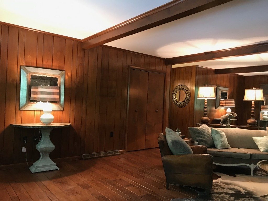
In a large space, symmetry pulls things together. This combination of demi-lune table/square mirror/white lamp is reflected at the opposite side of the room, pulling it all together as a unit.
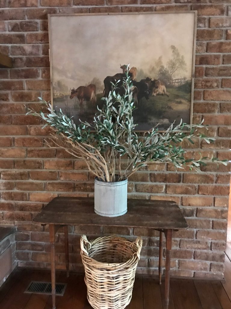
This is the brick wall, extended from the fireplace. The larger seating area looks into this space. The entry to the kitchen is directly to the right. My vision of this home is one that embraces nature, the farm, the country. This print of the cows sums it up nicely. The weathered-wood table makes a great landing spot for keys, umbrellas, etc.
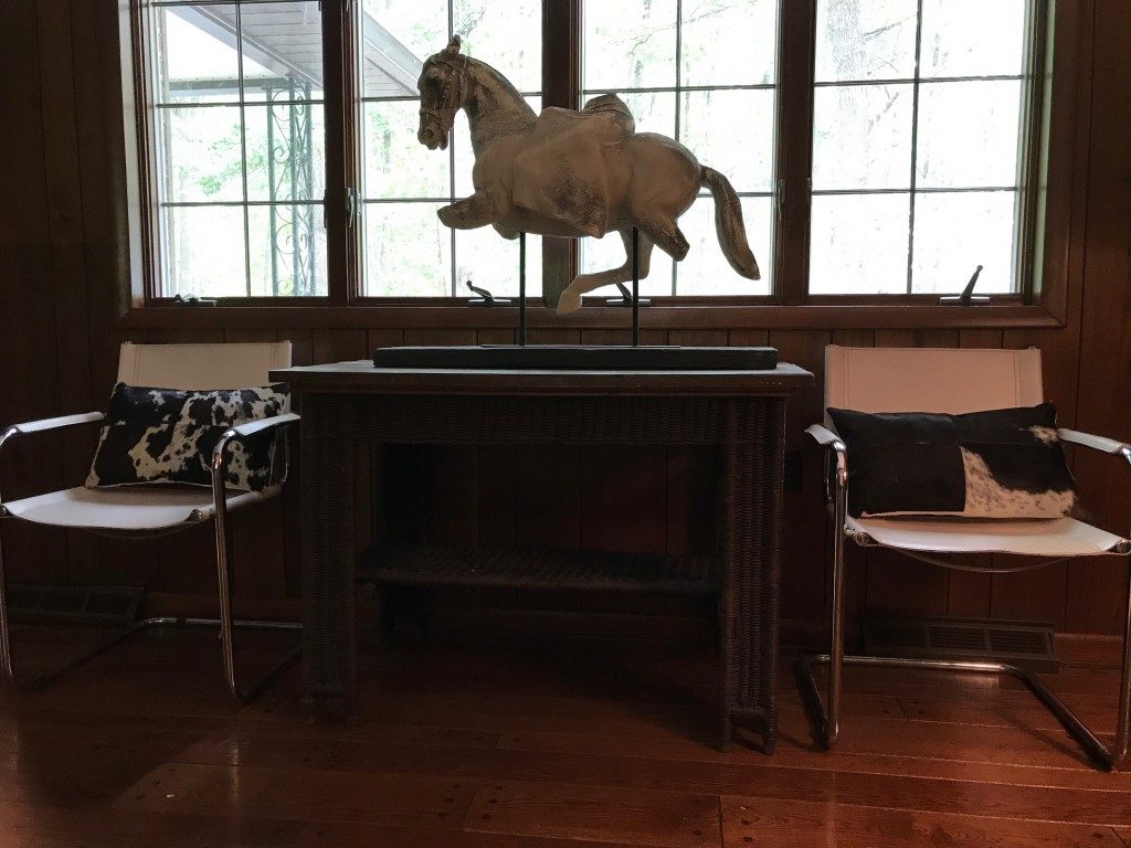
This is the front wall. The front door is directly to the left of this image. This quad-window provides great light, and we showcased it with the drama of this fabulous horse sculpture. The leather and chrome chairs update it, and the hide pillows pull it all together.
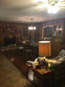
BEFORE: The kitchen is about the same size as the living room, and can handle a large table and could accommodate an island, too.

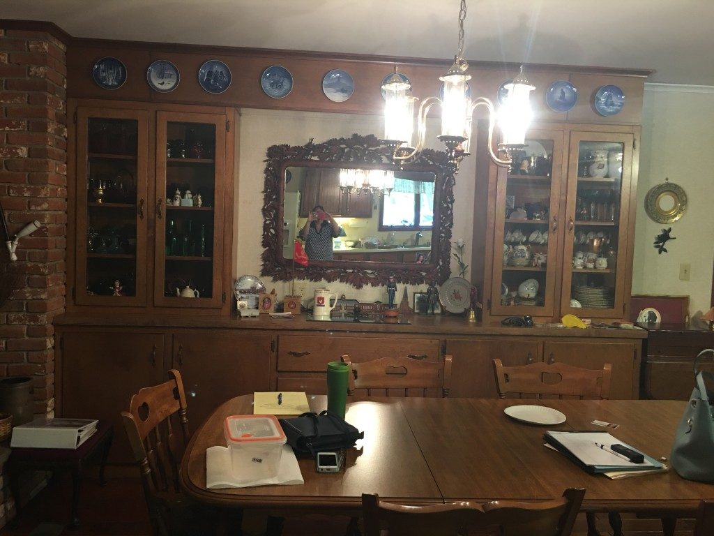
BEFORE: Here you can see the fireplace, built-ins, dining table, and sofa. These are the light fixtures I was begging to have replaced. I even brought replacements with me on installation day, hoping to convince the owners of its importance. I was not successful on that front…
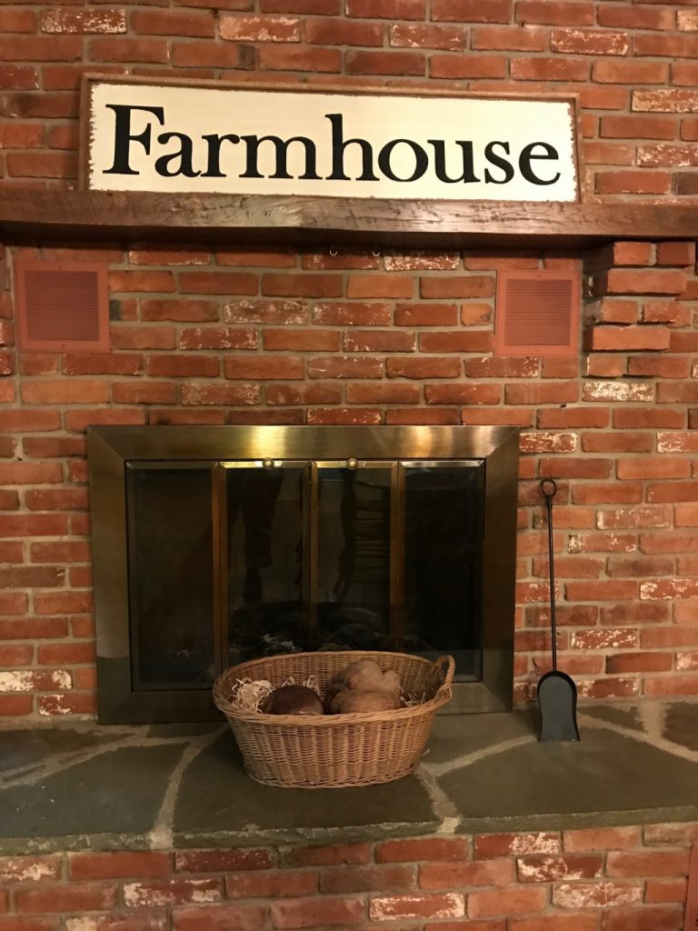
AFTER: The fireplace comes to life with all the clutter removed. The family did the hard work here, by clearing it all out. I love the simple, bold statement above the mantel.
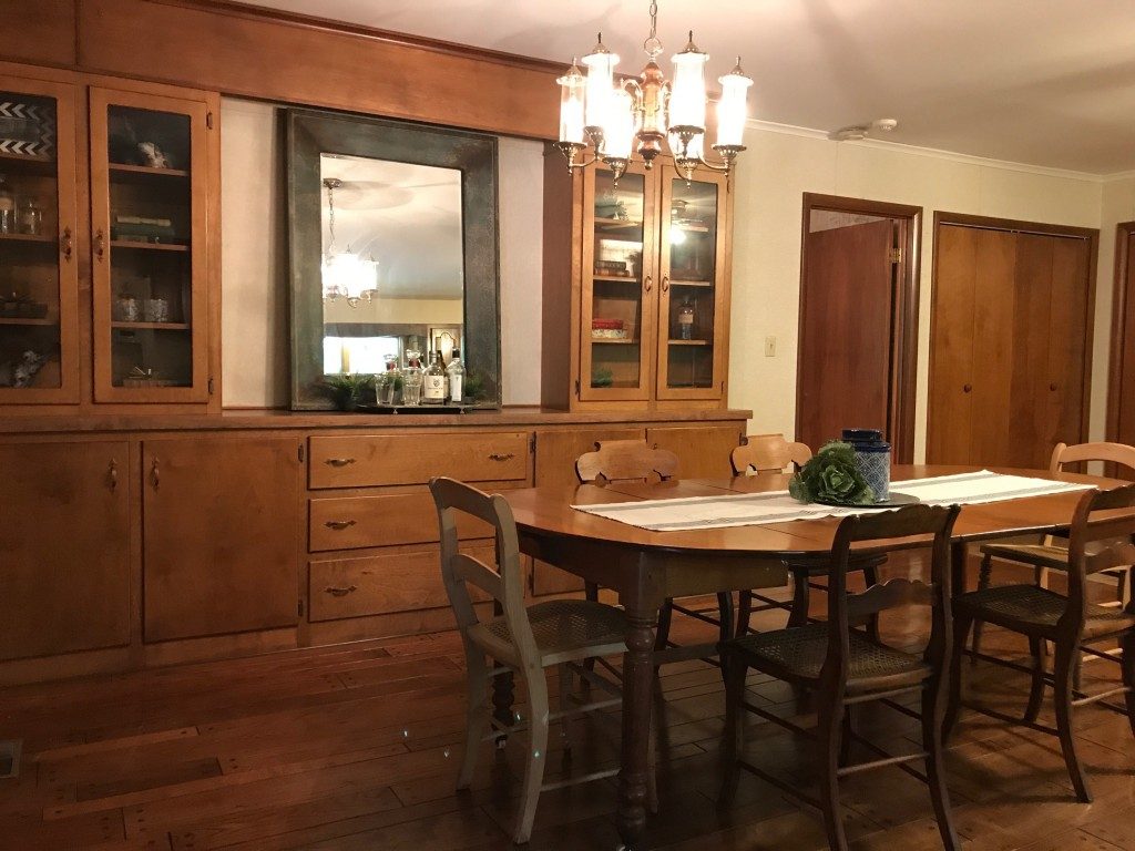
We replaced the table and chairs, keeping them traditional and simple. The built-ins are well-constructed, and I would use them as a bar if it were my home, and no room is complete without a great mirror! The open door at the back leads into the master bedroom. I ask only that you imagine this space with this chandelier over the table:
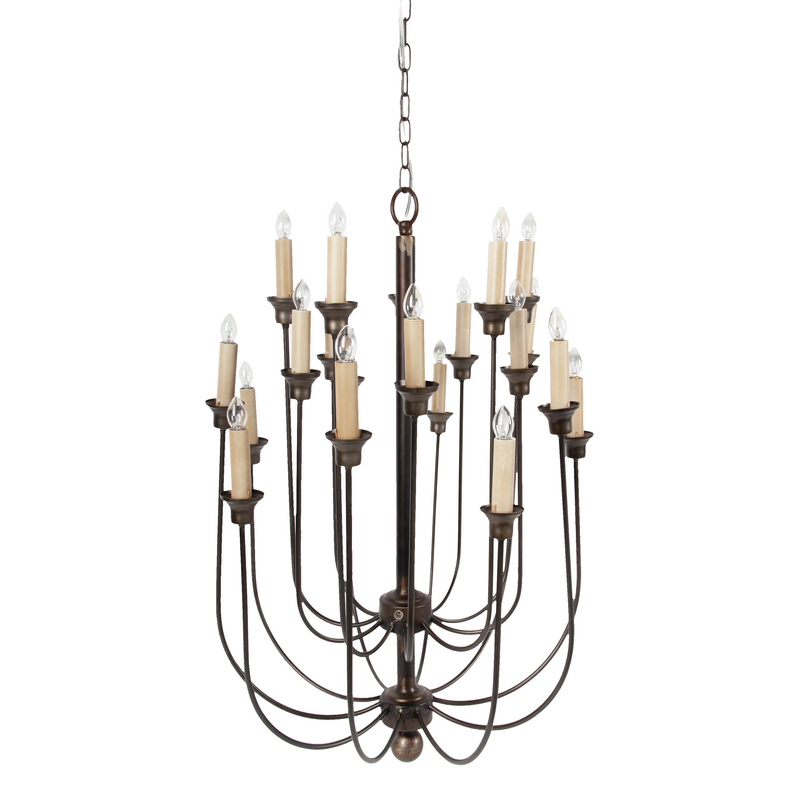
Yes, I know, I should just let it go . . .
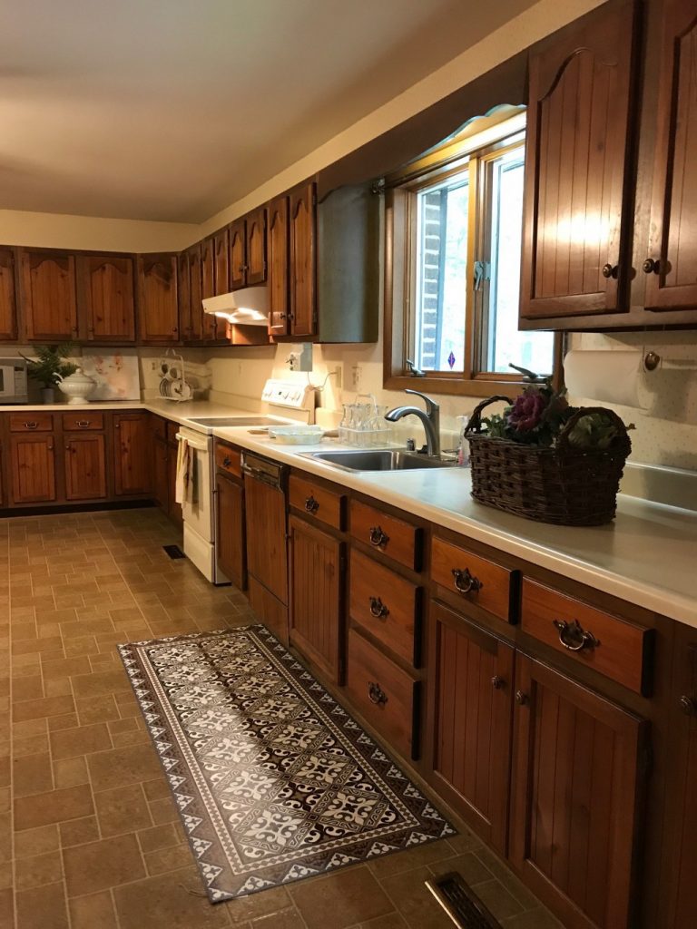
The counters are simply cleared of clutter, with a few decorative elements added for interest. What improves this space the most is 1) removal of the curtains, and 2) addition of the vinyl rug.
Directly to the back of the kitchen, is the master bedroom.
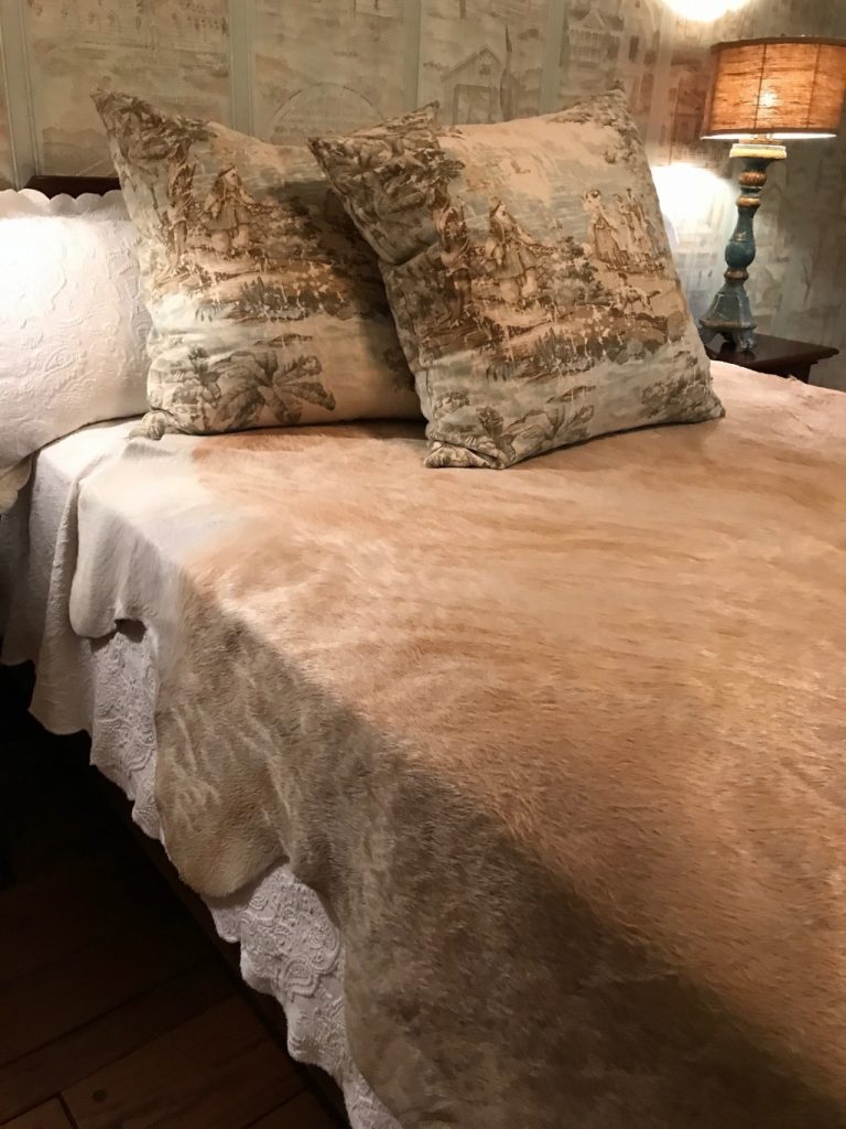
Though I don’t have any BEFORE pictures of the master bedroom, suffice it to say that all of the furniture in here is from the house. We updated the bedding, lamps (they’re the same ones I have in my bedroom), and my absolute FAVE element: the super-soft hide on the bed! It makes you just want to curl up and go to sleep.
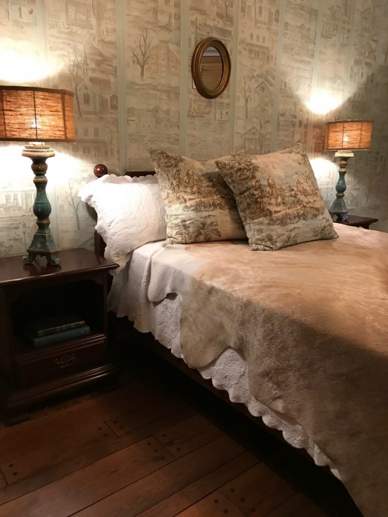
That’s not wallpaper, by the way. That’s printed paneling. I’ve never seen anything like it. Fortunately the colors worked with the elements we added, so I put it in the WIN column.
The other side of the kitchen opens onto a generously-sized, enclosed breezeway, which provides access to the front yard, back yard, laundry room, garage, and unfinished basement. Here’s what we did with it:
We did some work in the second bedroom and office, as well as adding some accessories to the bathrooms – and removed ALL curtains throughout the house (in a deeply wooded spot like this, there’s no need for curtains!).
Click here to see the full tour of the house from the listing website.
I hope you enjoyed this transformation. I can’t even describe how excited and pleased I was by the results of this challenge. It really has become a home I would be comfortable in.
Thanks for reading,
Virginia