

Actually, this should be titled, “Before & Now”, because while it’s technically ‘after’ pictures I have, they are not the magazine-ready kinda after pictures you may be hoping for. Things happen around here in baby steps – mainly because we inevitably run into the unexpected.
So this post is really an update on the ‘cottage’ we’re working on. And I can hardly express how happy I am to just be this far along in our process.
ROOM #1:
BEFORE
You may recall that all that wood is actually contact paper. And those parquet floors are stick-on vinyl tiles.
 So here’s what we had after removing the contact paper and vinyl tiles. Yes, those are holes in the wall. But the hardwood floors had a great patina.
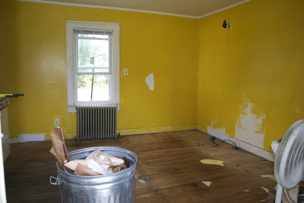
AFTER:
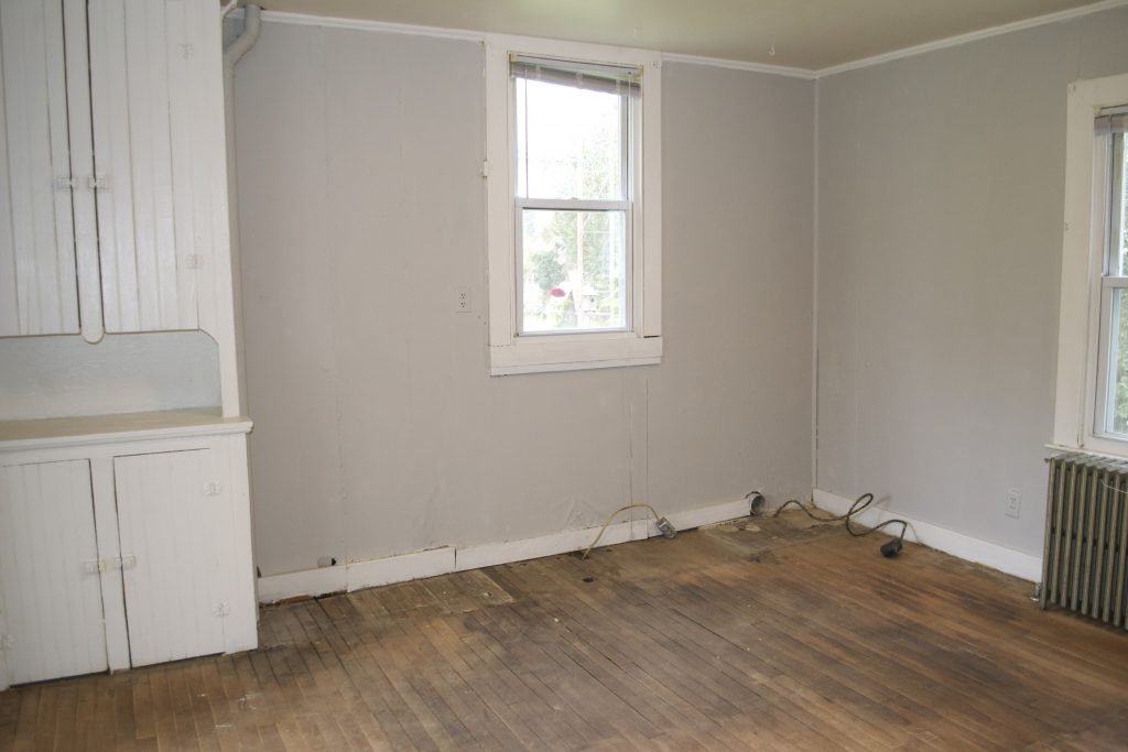
This is what we have today. A bit of patching, a couple gallons of Farrow & Ball’s Pavilion Gray, trimmed with Benjamin Moore’s White Dove, and it’s worlds better. Don’t you think? It makes me so happy to open the door now!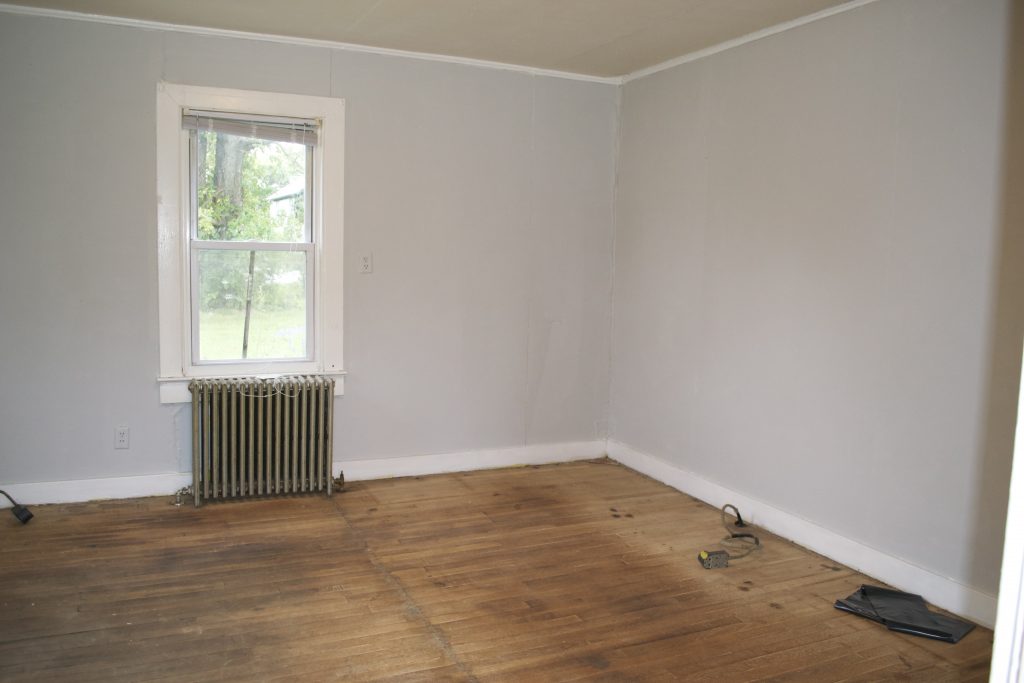 I just LOVE the old built-in cupboard!
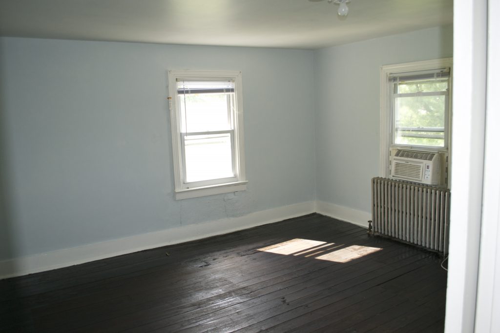
 Here’s a detail of the colors. So pretty and calming.
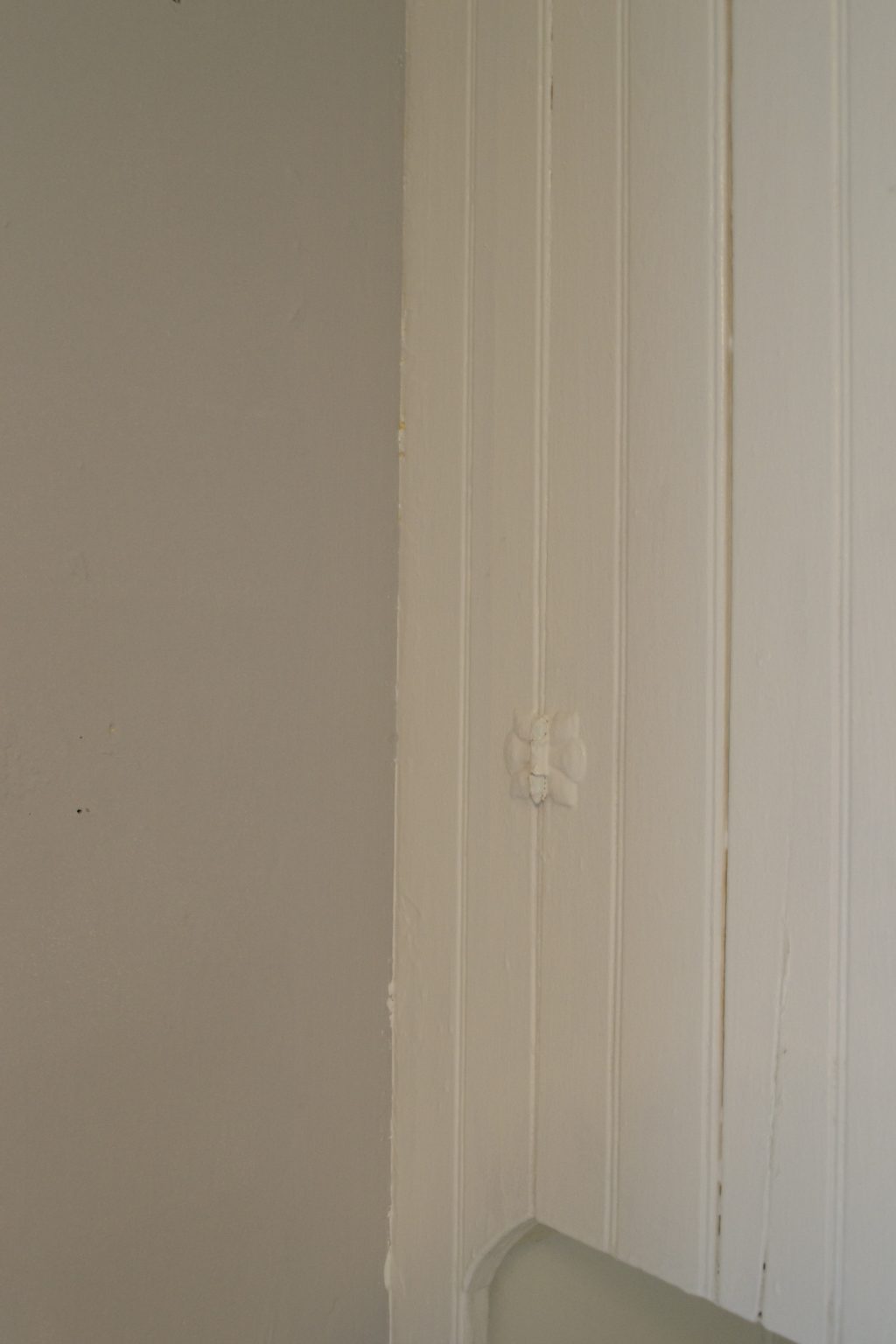
ROOM #2:
BEFORE
This room seemed to have the most potential because the lighting is so nice and the wainscoting has so much charm. But this room had the stickiest floor tiles of all. We tried everything, and finally ended up using a belt sander to sand the gunk off the floors. 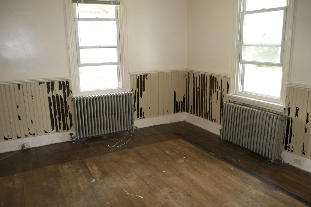
AFTER
We had initially planned on staining the floors after sanding, but I really like the look of the raw sanding. The patina would be totally lost when covered by stain. What do you think?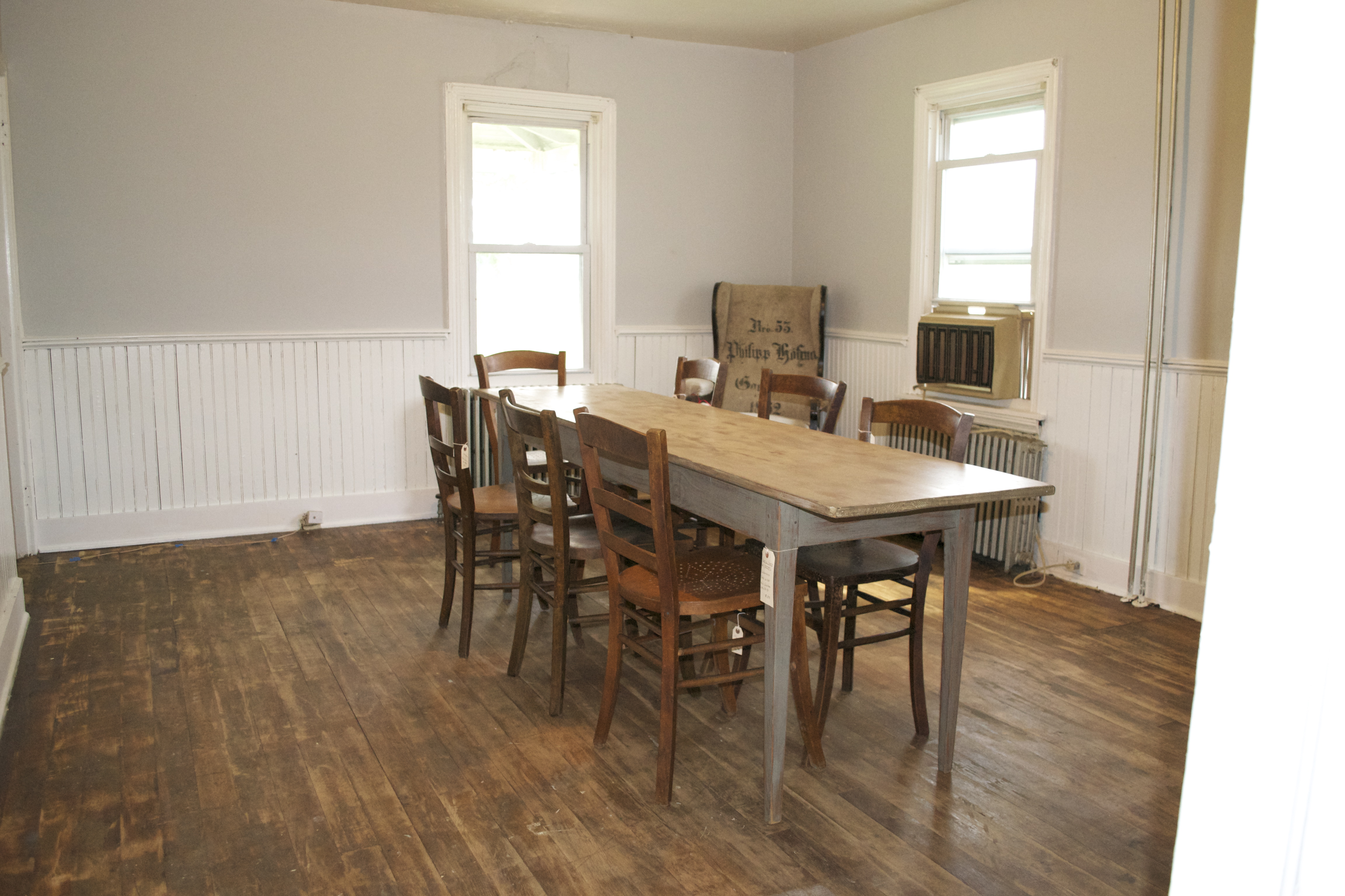 Room #2 BEFORE
(with the ‘parquet’ floor) Parquet floor removed
AFTER
And, voila! The wainscoting did not disappoint. Nor did the soft natural lighting of the room.  Detail of the wall color in Room #2
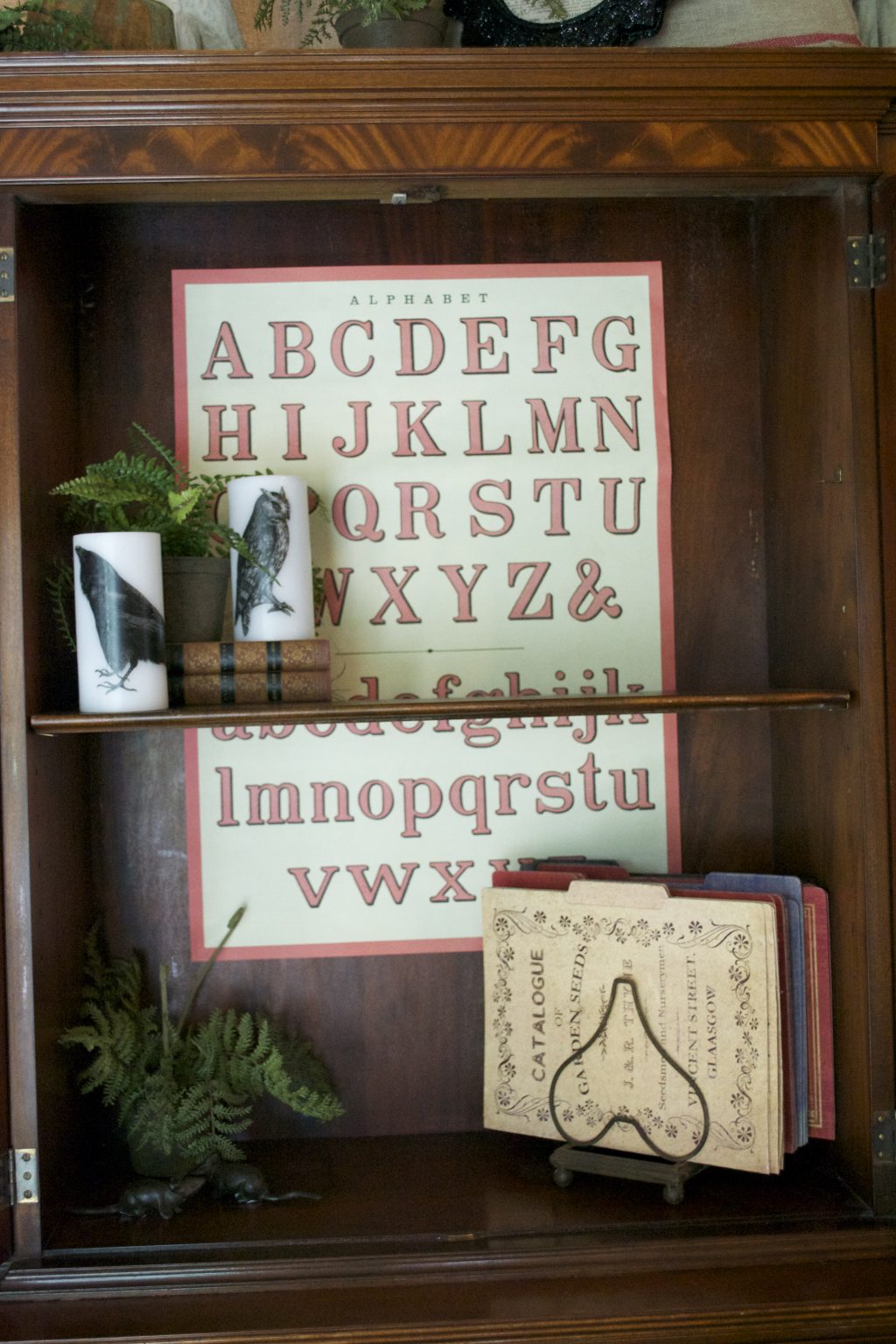 It’s the same Farrow & Ball Pavilion Gray that’s in the first room, yet look how the lighting changes it. I just LOVE that about the F&B paints.
 Room #3
BEFORE
Again with the floors. And this wall color was almost like a trip to the Caribbean. It was super intense. The ‘parquet’ floors removed.
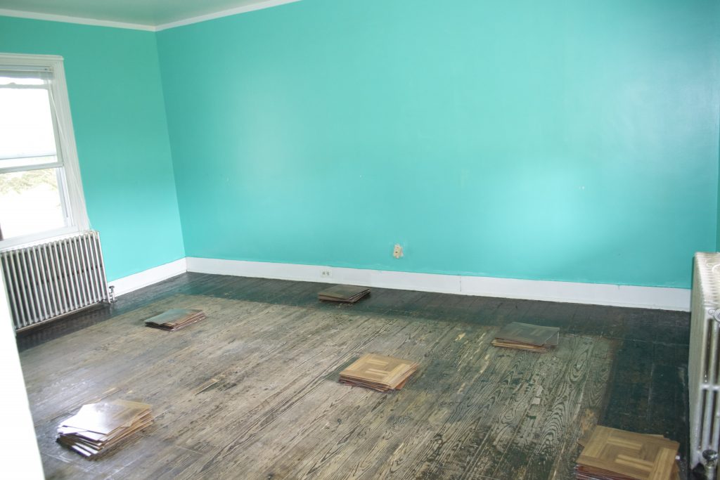 AFTER
AFTER
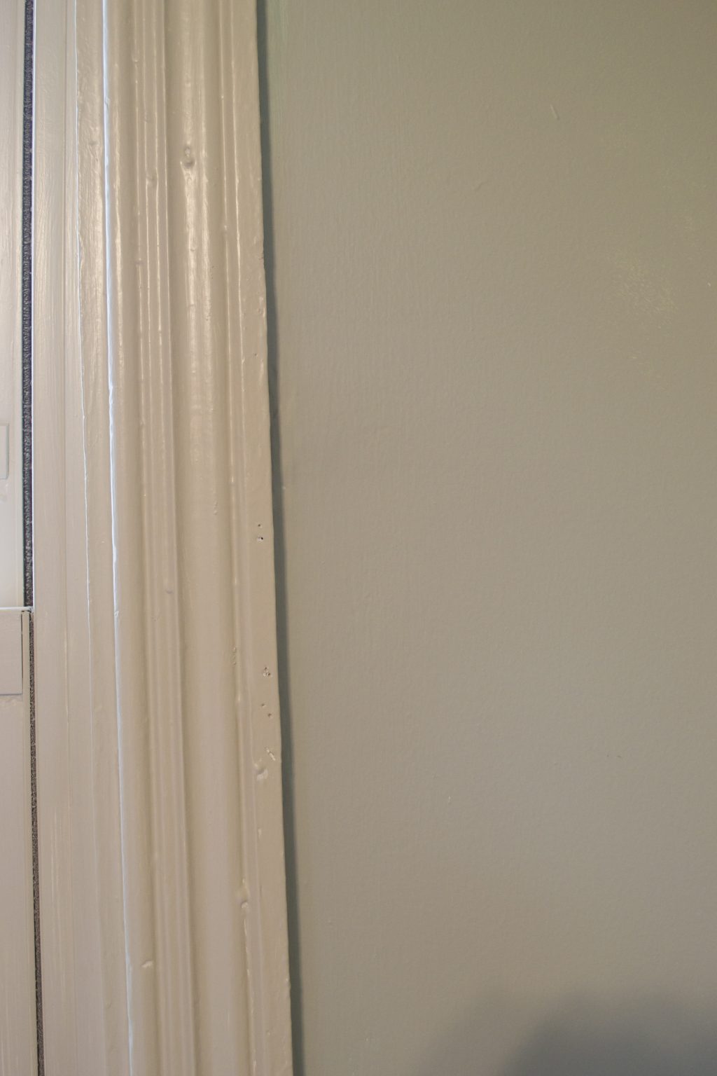
We’re still working on this one, but the walls are finished, painted Farrow & Ball’s Blue Gray, with F&B’s Old White as the trim. The combo is like a softer, warmer version of the colors in the other two rooms. A really comforting transition.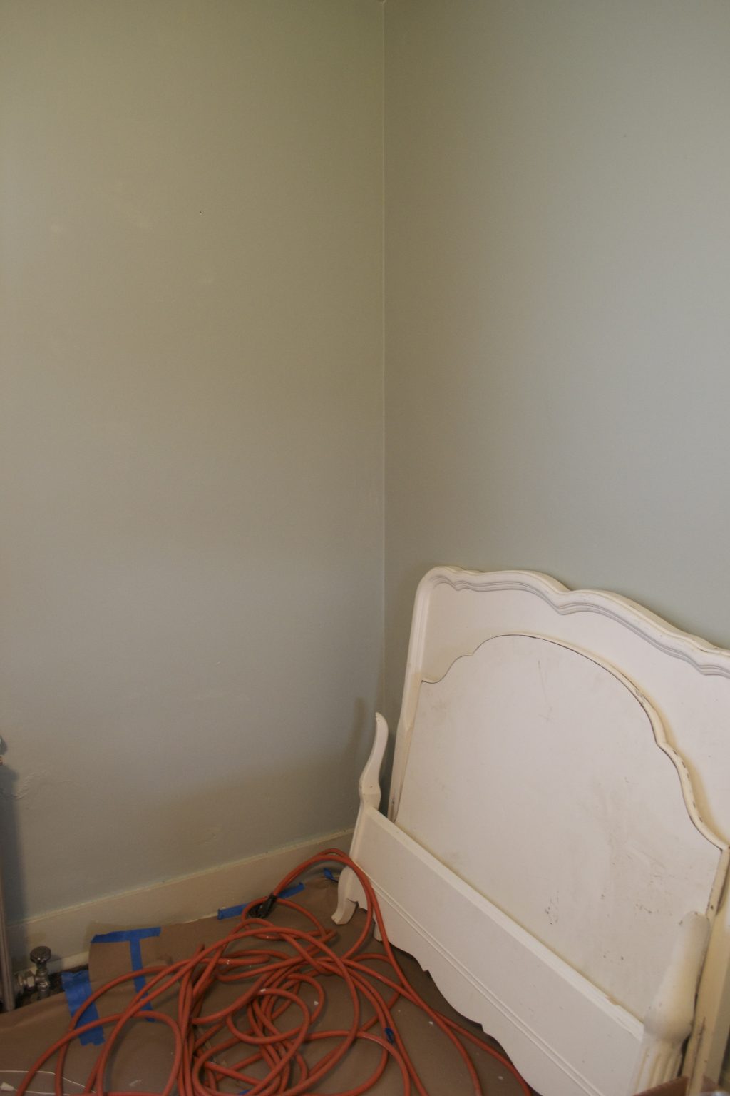 Detail of the wall and trim colors.
Room #4
BEFORE
Moving upstairs, this room is directly above Room #2 with the wainscoting, so it has that beautiful natural light. Even though it’s the smallest room in the house, it’s one of the prettiest.
AFTER
And here’s what paint can do. Farrow & Ball’s Borrowed Light, trimmed with Benjamin Moore’s White Dove. Upstairs we did stain the floors, using Rustoleum’s Kona stain. Don’t you just love the deep, rich floors in contrast to the pale walls and trim?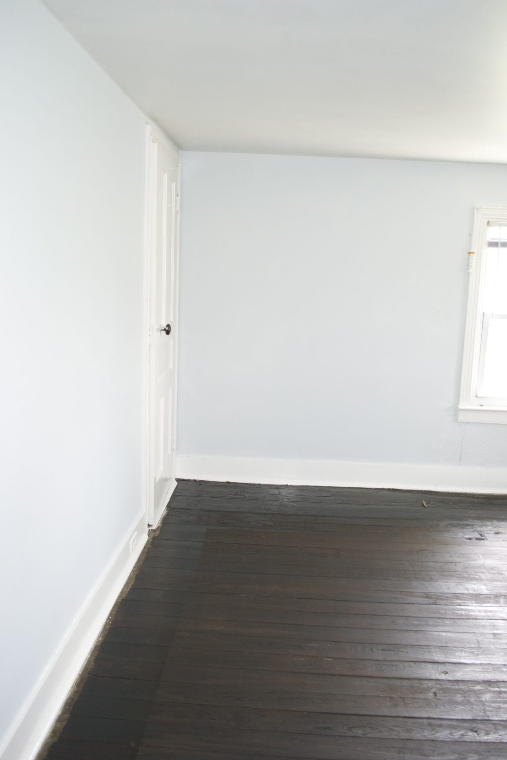 BEFORE (Room #4)
AFTER (Room #4)
Another angle of this beautiful room. You just want to stay in there it’s so pretty.
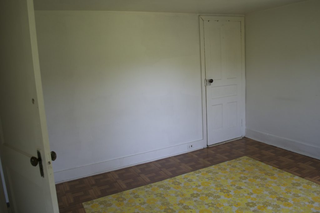
ROOM #5
BEFORE
This is the room above the turquoise room. It had the grungiest walls and trim of any room in the house. It took 2 coats of primer to make them paintable. And, like every room in the house, it had the vinyl tiles on the floor.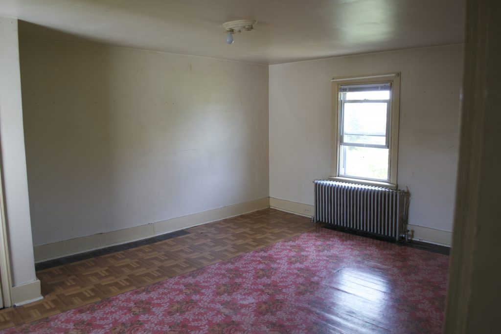
AFTER
And here it is with F&B’s Blackened on the walls and Cooking Apple Green on the ceiling, and Benjamin Moore’s White Dove trim. We used the Rustoleum Kona stain throughout the upstairs. Another view with more of the ceiling showing.
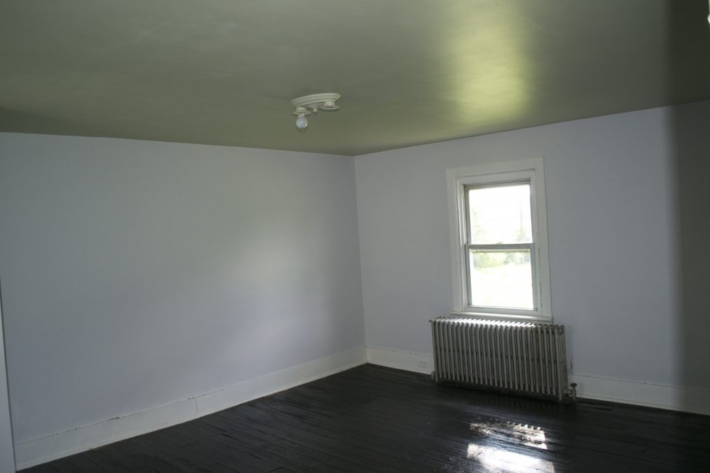
So there you are. We’re about to finish up completely with the renovating process and begin the decorating – my favorite part, of course. I’ll keep you posted!
Thanks for reading,
Virginia